Let's deep dive into how we build this feature and why I took certain design decisions
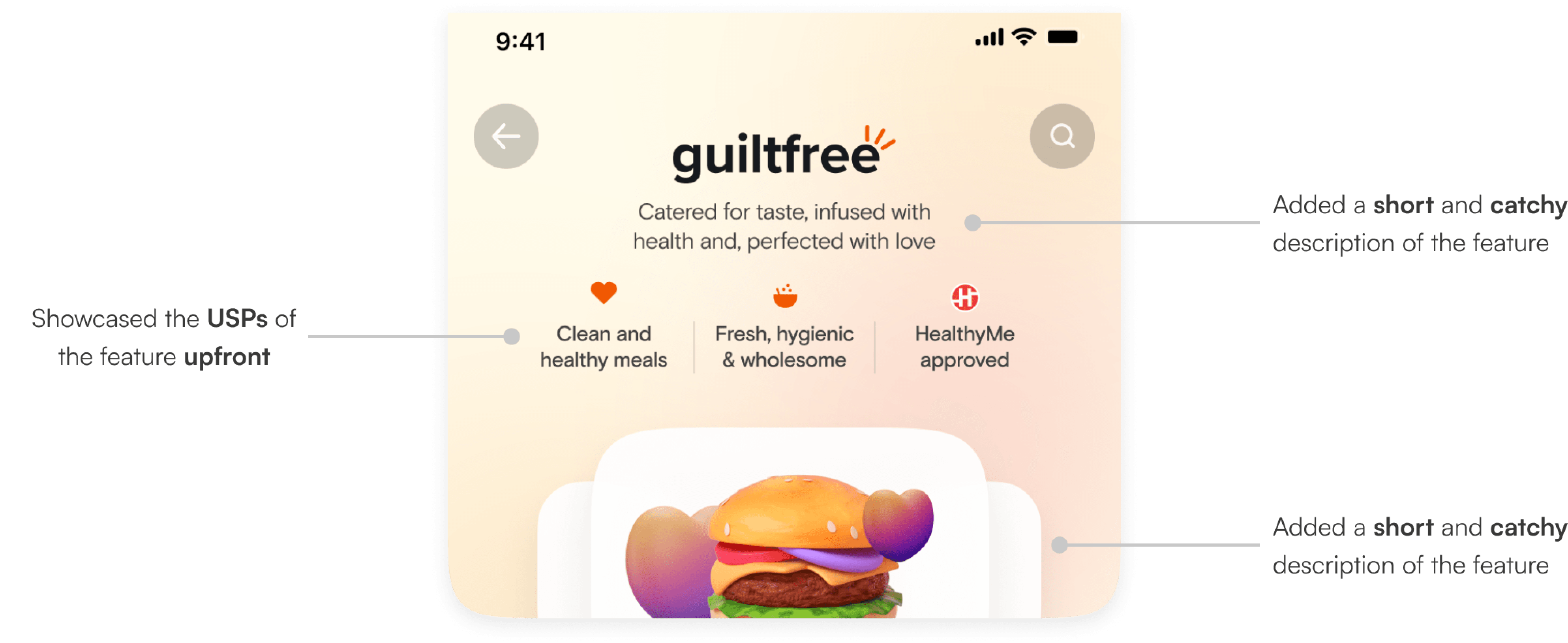
The header
Being the first section, it needed to clearly show what the feature is all about so users could understand it at a glance. I worked on both the visuals and the feature name to make this clear.
Final Designs
Iteration 2
Iteration 1

Cross promoting and ab testing!
Our team had also introduced a new “Ready Made Carts” feature for users to easily order curated selections. We saw this as a great opportunity for cross-promotion!
That's a wrap!
This project was live for a quarter but phased out ahead of Swiggy's IPO, to focus on high profit projects!
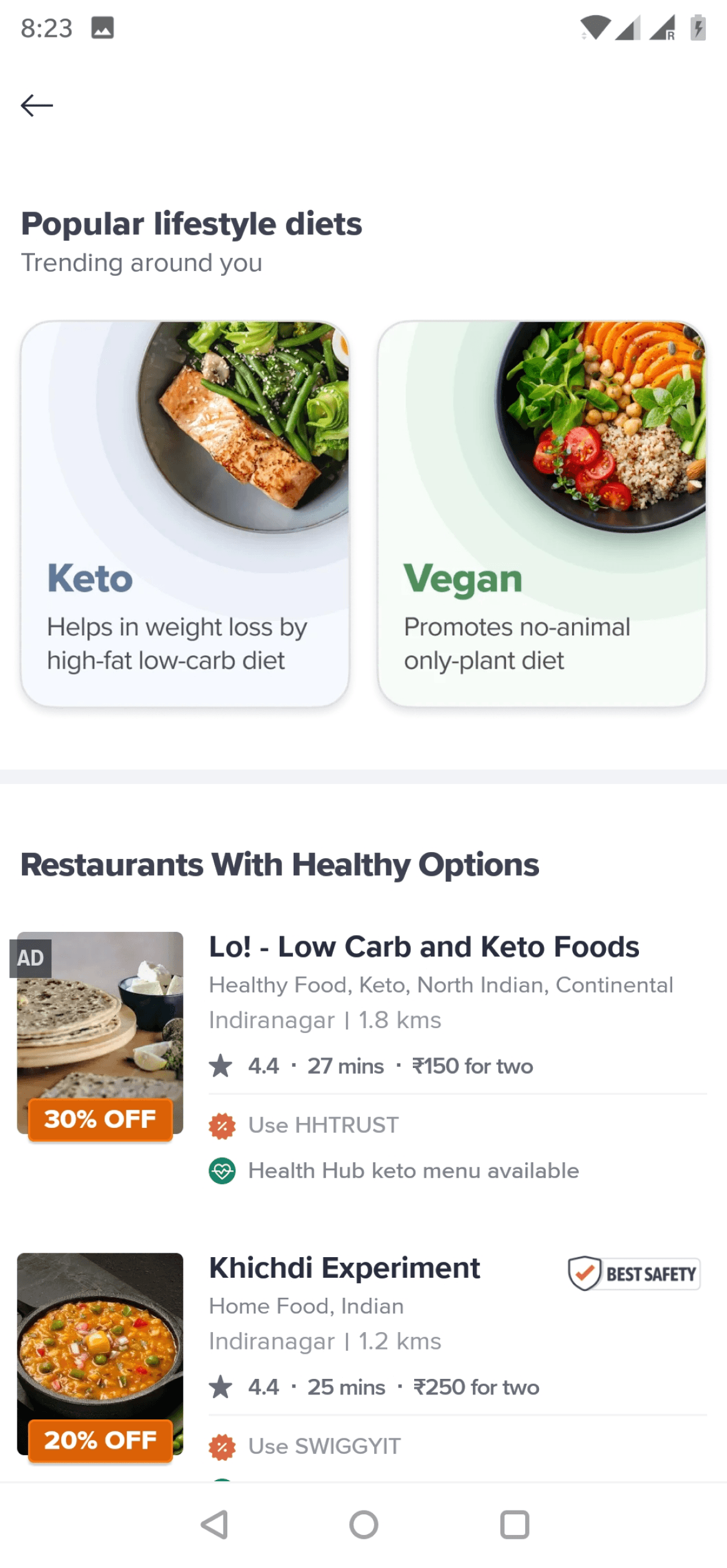
filtering through curations
As the user scrolled, we wanted to aid their selection process. We did using 3 design principles: adding familiarity, adding a human based touch and personalization. Let’s dive deeper into how we achieved this-
filtering through curations
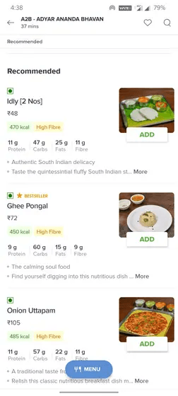
The last section of the page included a long listing of restaurants where we added personalized breakpoints based off the users order history
A. Video based personalization
By incorporating this human element, we aim to create a more relatable and engaging experience for users, helping them make informed choices.


B. quiz based personalization
This quiz is designed to capture the users goals and dietary preference to curates a selection of products and recommendations that resonate with their unique situation.
B
A
Whoop! It's getting a bit tight on space here!
You’re seeing the preview — find the entire journey on a larger screen

2024 Nisheta Gupta.
Made with love and lots of lattes (2%, hazelnut and caramel)
Last updated on Dec 21, 08:35 EST
Say hello! 🌼
Have an opportunity, wanna collaborate on
something cool or just say hello?
gupta.nisheta@gmail.com
2024 Nisheta Gupta.
Made with love and lots of lattes
Last updated on Dec 21, 08:35 EST
Say hello! 🌼
Have an opportunity, wanna collaborate on
something cool or just say hello?
gupta.nisheta@gmail.com
2024 Nisheta Gupta.
Made with love and lots of lattes
Last updated on Jun 22, 16:45 EST
Say hello! 🌼
Have an opportunity, wanna collaborate on
something cool or just say hello?
gupta.nisheta@gmail.com
What were we trying to solve for?
User Problem
Business Problem
Users wanted to enjoy their meals without feeling bad about it. While healthy meals are easily prepared at home, they craved something more exciting and indulgent when ordering in.
How did we do this?


Jobs to be done with the redesign
We wanted to funnel down on design and product strategies before getting deeper into the redesign.
refresh the tone
Healthy eating is enjoyable and not a chore, and we wanted the new designs and ideology to reflect this.
Unfamiliarity
Most of our user did not associate healthy eating with food ordering. It was imperative to break free from this mould.
dopamine hits
Our users love delight factors! These could potentially increase retention & encourage intent to order.

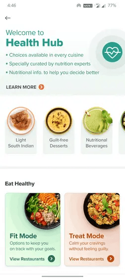
Revamping Swiggy’s Healthy Page
for a better user experience
Revamping Swiggy’s Healthy Page
for a better user experience
April 2024; 3 weeks
April 2024; 3 weeks
At Swiggy, we wanted to help people eat healthier even when they order!
At Swiggy, we wanted to help people eat healthier even when they order!
Swiggy is one of India’s largest food delivery platforms. Within the app, users could discover healthy alternatives of popular dishes at the Health Hub.
Swiggy is one of India’s largest food delivery platforms. Within the app, users could discover healthy alternatives of popular dishes at the Health Hub.
my Role
my Role
Responsible for research,
conceptualization, and design.
Responsible for research, conceptualization, and design.
Responsible for research, concept, and design.
Team
Team
Solo product designer, Product Manager, 4 engineers
Solo product designer, PM, 4 engineers
target users
Our users lay on a spectrum of health first to indulgent eaters. We revised our outlook to focus on a middle ground, rather than either extremity
Our first version did not see a lot of success because we only targeted healthy eaters who did not order frequently. We built features like calorie counters, which pushed away casual healthy eaters.
the sweet spot
Flavor-seeking eaters
Regularly order
Satisfaction-focused
Occasionally order
Healthy eaters
Rarely order
Why?
👉
Engaging occasional users can boost overall order frequency and brand loyalty
👉
Emphasizes on wellness and nutritious eating, appealing to a broader audience
👉
Potentially acquisition of healthy users who usually order groceries from Swiggy

The final DESIGNS
BEFORE
After

Whoop! It's getting a bit tight on space here!
You’re seeing the preview — find the entire journey on a larger screen